Here’s something most homeowners won’t admit out loud: their kitchen feels like every other kitchen on the block. Same beige walls. Same forgettable countertops. Same unremarkable nothing. And that’s a shame, because fixing it doesn’t require a full gut renovation. It requires one smart tile decision.
A backsplash is the single fastest upgrade you can make to a kitchen or bathroom. We’re talking about one surface that flips the entire emotional register of a room. In this guide, you’ll find backsplash tile designs that bring genuine character, practical kitchen backsplash ideas sorted by how adventurous you want to go, bathroom backsplash tile choices that feel deliberate rather than default, modern backsplash tile formats for clean and contemporary spaces, and backsplash tile patterns that shift a room’s atmosphere the moment guests walk in.
According to the 2024 U.S. Houzz Kitchen Trends Study, ceramic or porcelain tile is the most popular backsplash material at 54%, meaning more than half of homeowners already trust tile to carry both function and visual weight.
That confidence is earned. A well-chosen backsplash tile delivers more visual impact per square foot than almost any other surface in your home. TileBar offers an extensive range of styles, from handmade-look ceramic to large-format porcelain slabs, making it genuinely accessible to find the right fit without the usual overwhelm.
But before you even open a sample kit, the real first step is defining what kind of personality you want the room to radiate.
Personality-First Planning
Most tile decisions go sideways for one reason: people shop for tile before they’ve decided on a direction. They fall in love with something in isolation, something that has nothing to do with their cabinets, their floors, or the light in the room. Don’t do that.
Pick a Personality Lane That Fits Your Home
Think of these as mood orientations, not rigid categories. Warm and handmade delivers cozy, artisanal energy. The bold graphic reads playful and high-contrast. Calm minimal skews sleek and uncluttered. Vintage charm leans into nostalgic patterns. Nature-inspired brings in earthy texture. Luxe glam uses shimmer and movement. The industrial edge mixes raw materials with clean geometry.
The fastest shortcut? Match the tile’s emotional energy to your permanent finishes, countertop, cabinet, floor. Warm wood cabinets with a cold blue-gray tile will always feel slightly wrong, no matter how beautiful that tile looks in the showroom.
The 60/30/10 Rule for Backsplash Color
This rule is deceptively simple, and genuinely useful. Sixty percent of your visual weight belongs to your dominant surface, typically cabinets or walls. Thirty percent goes to secondary surfaces like countertops. The remaining ten percent is your accent, and that’s exactly where your backsplash lives.
That said, rules exist to be broken thoughtfully. In small kitchens, rentals, or spaces with open shelving, your backsplash sometimes needs to do more emotional lifting. In those cases, give it more of the color story. Own that decision.
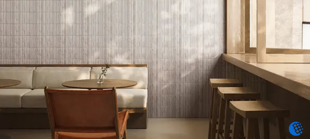
Finish and Texture: The Personality Multipliers
Glossy tile reads bright and clean, excellent for darker kitchens that need reflected light. Matte feels softer, more contemporary, without the bounce.
Texture, though, is what really changes things: handmade edges deliver organic warmth, zellige-look surfaces catch light in ways that feel almost alive, fluted or 3D profiles create actual shadow play, and crackle glaze adds quiet visual depth without demanding attention.
Grout is not an afterthought. It is a design decision. Matching grout creates calm and unity. Contrasting grout turns your tile pattern graphic and sharp. Same tile, fundamentally different result, based solely on grout choice.
With those foundations in place, the real fun begins.
Kitchen Backsplash Ideas With Standout Backsplash Tile Designs
The kitchen is where backsplash tile works hardest. Whether you want quiet artisanal character or a graphic statement that literally stops mid-conversation, these directions cover every level of boldness.
Handmade-Look Tile for Artisanal Warmth
Few things feel as genuinely custom as handmade-look tile, particularly behind a range, along an open shelving wall, or in a cozy kitchen that wants warmth without forcing it.
The slight imperfections are the point. Uneven edges. Subtle glaze variation. That’s what separates it from a catalog result. Use tighter grout lines with imperfect edges to keep the installation looking intentional rather than careless. Personality level: medium to bold.
Bold Checkerboard and Color-Block Layouts
Checkerboard never really disappeared, it just evolved. The modern versions, off-white paired with soft green, cream with clay, black with warm white, feel genuinely fresh rather than retro.
You can commit to full-height coverage for a proper statement, or limit it to a feature zone directly behind the cooktop. The second approach lets you get the drama without it taking over the entire room. Personality level: bold.
Modern Backsplash Tile With Linear and Kit-Kat Formats
Linear, kit-kat, and baton tiles create strong visual impact through proportion and line rather than pattern contrast. These work beautifully in contemporary kitchens with flat-panel cabinetry. Stack them vertically to add visual height.
Stagger them horizontally for structure. Frame a panel behind the range and you get something that feels almost architectural, considered, specific, yours.
Statement Mosaic and Slab-Look Porcelain
Mosaic goes for intricate detail. Glass shimmer, stone micro-mosaic, mixed materials, when done well, it reads like art on the wall. To keep it curated rather than chaotic, quiet your counters and repeat one mosaic color in hardware or textiles. It ties the room together without screaming.
Slab-look porcelain goes the opposite direction, personality through veining and scale alone. Fewer grout lines mean a more expansive feel, which works exceptionally well in smaller kitchens where you need every perceptual square inch.
The designer trick that bridges both? Mixed-scale pairing. A simple field tile with an accent strip. One hero panel surrounded by a calm supporting tile. One expressive material, one quiet one. That balance is everything.
Backsplash Tile Patterns That Instantly Change the Vibe
Here’s something worth knowing: the tile itself is only half the story. *How* you lay it is equally transformative. The right backsplash tile patterns can make even a modest tile feel completely custom.
Herringbone, Chevron, and Stacked Grid
Herringbone reads as “designer-chosen” almost immediately. The diagonal movement works especially well with subway tile, baton formats, or marble-look porcelain.
Always center your layout before cutting to keep symmetry around focal points, off-center herringbone is one of the most common installation regrets homeowners share.
Chevron sharpens that same diagonal energy into something crisper. It’s the better pick when you want geometry that feels precise rather than organic. Use a close-match grout to prevent the pattern from feeling too busy.
The stacked grid strips everything back to its most architectural form. Vertical stacking draws the eye upward, a smart move in rooms with low ceilings. Horizontal stacking visually widens a narrow space. In monochrome kitchens, the grid lets texture carry the personality load without needing any color at all.
Brick Bond, Offset Layouts, and Patchwork Moments
Brick bond is reliable but doesn’t have to feel generic. A 1/3 offset instead of the standard 1/2 creates a rhythm that feels fresher, most people can’t immediately name why it looks better, but they notice. Extra-long subway tile modernizes the classic layout without abandoning it entirely. Color-wash tiles add gentle variation without going all-in on pattern.
For maximum personality, patterned patchwork moments are unmatched. Use them as a framed panel, a coffee bar zone, or a defined accent wall, not everywhere. Keep surrounding surfaces simple so the pattern actually has room to breathe and land.
Bathroom Backsplash Tile Ideas That Feel Intentional
The bathroom backsplash is the most underused design opportunity in most homes. It’s an afterthought for homeowners who would never let the kitchen go unaddressed. Treat it with the same intention and the payoff is significant.
Vanity Backsplash Height and Water Resistance
A 4-inch mini splash reads minimal and contemporary. An 8-to-10-inch backsplash looks like an actual design decision was made. Full-height tile up to the mirror or wall top is the boldest move and works best when mirror proportions support the scale. Always align tile height with your lighting placement for the cleanest visual result.
For bathroom backsplash tile that stays clean under real daily use, material and finish selection matters more than it does in the kitchen. In hard-water areas, matte tile actually hides water spots better than glossy, counterintuitive, but true. Epoxy grout resists staining and moisture far better than standard cement grout. Natural stone always requires proper sealing.
Spa-Style and Powder Room Approaches
Spa-inspired bathrooms call for large porcelain, soft neutrals, subtle texture, and vertical stacking that draws the eye upward. Warm metal fixtures paired with warm white tile and a soft greige grout consistently deliver results that feel considered rather than assembled.
The powder room plays by completely different rules. Its small footprint is permission to go bold. High-contrast patterns, saturated color, metallic or glass accents, all of it works here. Tie the backsplash color to wallpaper or an accent paint shade, and the whole room suddenly feels designed with intention rather than selected by committee.
Material-by-Material Guide
Every tile has a personality and a performance profile. Knowing both helps you choose something that looks exceptional on day one and holds up over the long run.
| Material | Personality | Best Use | Maintenance |
| Ceramic | Color-rich, expressive | Color/glaze details | Easy, beginner-friendly |
| Porcelain | Clean, upscale | Large format, slab looks | Very durable, low-effort |
| Glass | Light-reflective, modern | Dim kitchens, small baths | Needs even walls, quality sheets |
| Natural Stone | Luxe, organic | Feature areas | Requires sealing, gentle cleaners |
| Metal/Mixed Mosaic | Contemporary edge | Accent zones | Moderate, avoid abrasives |
Ceramic cuts easily and holds glazes beautifully, ideal for expressive color and pattern work. Porcelain is denser, handles large formats brilliantly, and is arguably the most versatile option on the market. Glass tile reflects light in ways no other material quite matches, but uneven walls will telegraph through, so surface prep is non-negotiable.
Natural stone brings timeless luxury; marble and travertine need sealing and gentle cleaners, and stone-look porcelain often delivers more personality per dollar. Metal and mixed mosaics belong in accent zones rather than full walls, pair them with minimal cabinet hardware to avoid visual clutter.
Color Strategies That Make Backsplash Tile Designs Feel Like You
Color is where the backsplash stops being a surface choice and starts being genuine self-expression. Americans spent an estimated $603 billion on home remodeling in 2024, a figure that reflects enormous collective experience in learning what actually works.
For neutral-on-neutral approaches, texture does the expressive work. Handmade surface variation, micro-glaze differences, dimensional shapes, all of these add life to white or ivory tile without committing to color. Watch grout undertone carefully. Warm versus cool reads as a meaningful perceptual difference in a finished room.
Saturated color is less risky than it feels. Concentrate it in one bold zone, range wall, coffee bar, vanity, and repeat one element of that color elsewhere through a rug, art, or stool cushion. That repetition is what makes a bold tile feel styled rather than accidental.
Two-tone backsplashes add designer-level depth without full commitment. A dark lower band with a lighter upper section. A framed inset. A single stripe detail line. Each approach creates interest while keeping countertops free to stay calm and simple.
Layout Details That Separate “Okay” From “Custom”
The difference between a backsplash that looks installed and one that looks designed comes down to details most homeowners discover far too late in the process.
Map your focal points first. Identify where the tile becomes the hero, range hood, sink wall, and where it stays quiet on returns and side walls. Symmetry behind ranges creates a built-in quality that reads expensive without being expensive.
Finish every exposed edge intentionally. Schluter trims, pencil liners, and bullnose alternatives all create a polished frame around your tile. Mismatched or raw edges immediately undercut an otherwise beautiful installation.
Outlets and switch covers are the most overlooked personality-killers in any tile project. Plan for under-cabinet power strips where possible. Align outlet grids with tile joints. Use matching cover plates. Avoid tiny tile slivers around outlets by planning cuts well in advance.
On grout width: thin lines read sleek and modern. Thicker lines suit rustic or handmade tiles. Contrasting grout amplifies geometry. Matching grout creates calm sophistication. Same tile. Completely different result. This single decision deserves real attention before you start.
Trending Backsplash Tile Designs for 2026
The most compelling 2026 directions aren’t about chasing novelty for its own sake. They’re fresh applications of texture, color, and sustainability that make spaces feel genuinely current without looking like they’re trying too hard.
Fluted and 3D relief tiles create personality through shadow and dimension. Use them in feature wall zones only, and add under-cabinet LED lighting to enhance the depth dramatically, it’s a combination that photographs beautifully and lives even better.
Color-drench design takes a different approach entirely, using paint and tile in unison to wrap a space in one cohesive tone. It works especially well in small kitchens and powder rooms where the immersive quality feels intentional rather than claustrophobic.
The “framed backsplash art panel” concept treats tile like gallery work, a centered patterned or mosaic panel behind the range or sink, surrounded by quieter field tile. It’s upscale without tipping into busy.
According to the NKBA 2026 Kitchen Trends Report, 60% of designers expect new statement colors to appear specifically in the backsplash, tying wallpaper as the top surface for color expression. That’s a forward-looking endorsement of the personality-first philosophy this entire guide is built on.
Sustainable materials are also gaining serious real-world traction, recycled glass mosaics, locally made ceramic, low-VOC adhesives. And the good news is that sustainability no longer forces a rustic aesthetic. Pair eco-conscious tile with modern flat-panel cabinets and the result feels completely current.
Quick “Pick Your Backsplash” Selector
White cabinets give you the most freedom. Strong contenders: colorful kit-kat vertical tile, a checkerboard feature zone, or textured handmade white tile with warm grout.
Counters with strong veining ask the backsplash to support rather than compete, solid-color tile, a stacked pattern, and low-contrast grout all let the stone lead. Small or low-light kitchens benefit from glossy tile, lighter tones, and fewer grout lines through larger format choices.
If you want a bold personality but easy resale, keep the statement in a limited or removable feature zone. Choose a classic pattern in a fresh modern color, and let the material itself be timeless even when the layout feels current.
Frequently Asked Questions
Which backsplash tile designs add personality without overwhelming a small kitchen?
Choose one expressive feature zone, behind the range or sink, and keep everything else simple. Handmade-look white tile with warm grout, or a vertical kit-kat strip in a muted color, adds character without visual noise.
Modern backsplash tile: vertical stack or herringbone, which reads more current right now?
Vertical stack reads cleaner and more architectural.
How can I make my backsplash stand out without it clashing with the rest of my kitchen?
Use the 60/30/10 rule to balance your colors. Let your cabinets and walls take up 60% of the visual space and your countertops 30%; this leaves the final 10% for your backsplash to act as the perfect accent. To ensure a cohesive look, match the “emotional energy” of your tile to your permanent finishes—for example, pairing warm wood cabinets with earthy, handmade-look tiles rather than cold, clinical tones.