Whether you are a marketing manager trying to communicate data clearly or an educator looking to make lesson content more engaging, finding the right infographic tool can feel overwhelming when so many options exist. This article is designed to help business professionals and educators evaluate their choices and walk away with a clear understanding of what features actually matter, what trade-offs to expect, and which type of tool is most likely to meet their specific needs. By the end, you will have a practical framework for choosing the software that fits your workflow, your team, and your goals. No prior design experience is required.
Why Infographics Matter in Business and Education
There is a reason infographics have become a staple in boardrooms, classrooms, and social media feeds alike. Research consistently shows that people process visual information significantly faster than plain text, and that well-designed visuals improve both retention and comprehension. For businesses, infographics can transform complex data into shareable assets that drive engagement, support sales conversations, and communicate value to stakeholders. For educators, they can simplify abstract concepts, accommodate different learning styles, and make curriculum materials more memorable across all age groups.
The challenge is not convincing people that infographics are worth creating. The challenge is finding the right tool to create them quickly, consistently, and without requiring a graphic design background. The software landscape has grown considerably in recent years, and the best options now offer everything from drag-and-drop templates to AI-powered generation, making professional-quality infographics accessible to almost anyone.
Eight Criteria for Evaluating Infographic Software
Before comparing specific platforms or tool types, it helps to establish a clear evaluation framework. Not every tool is built with the same priorities, and what works for a solo educator may fall short for a marketing team of fifteen people. Use these criteria as your decision-making checklist.
1. Ease of use for non-designers. The best tools are intuitive enough that someone without formal design training can produce polished work in under an hour. Look for drag-and-drop interfaces, pre-built layouts, and contextual guidance that removes the guesswork.
2. Template depth and variety. A strong template library is not just about quantity. It is about having templates that match your actual use cases, whether that means statistical summaries, process flow diagrams, timelines, comparison charts, or educational lesson breakdowns. Templates should also be fully customizable, not locked down.
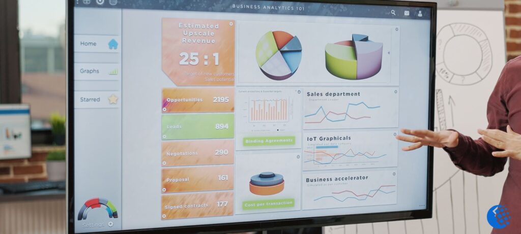
3. Data and chart integration. Business users in particular need tools that can connect to or import data sources and render that data as charts, graphs, or visual summaries without requiring manual entry every time. Look for tools that support CSV uploads or live data connections.
4. Brand control and consistency. For teams and organizations, the ability to set brand colors, fonts, and logo placements across all infographics is critical. Some tools offer dedicated brand kit features that save these settings globally and apply them automatically to new projects.
5. Collaboration features. Whether you are working with a co-teacher, a content team, or a department full of stakeholders, real-time collaboration and comment functionality can dramatically reduce revision cycles. Check whether multi-user editing is available on the plan you are considering.
6. Export and sharing options. A great infographic is only useful if it can be shared effectively. Evaluate whether the tool exports to the file types you need, such as PNG, PDF, SVG, or HTML, and whether it supports direct sharing to email, social platforms, or learning management systems.
7. AI and automation capabilities. More platforms now include AI tools that can generate layouts from text prompts, suggest design elements, resize content for different channels, or remove image backgrounds automatically. These features can save hours of production time, especially for teams with high output demands.
8. Pricing structure and scalability. Many tools offer a free tier, but the most useful features are often gated behind paid plans. Understand what you get at each pricing level, whether you are paying per seat or per workspace, and whether the cost scales reasonably as your team or student group grows.
The Main Types of Infographic Tools and Who They Serve
Not every business or educational institution needs the same kind of infographic software, and the market reflects that diversity. There are three broad categories worth understanding before you narrow your search.
Template-Driven Design Platforms
These are the most widely used tools for non-designers. They are built around large libraries of professionally designed templates and offer a drag-and-drop editing experience that prioritizes speed and accessibility. Users choose a layout, swap out text and imagery, apply brand colors, and export in minutes. These platforms are ideal for marketing teams, communications departments, classroom teachers, and anyone who needs to produce visually consistent content at scale without hiring a designer.
The trade-off is that highly customized or complex designs can sometimes feel constrained by the template structure. However, for the vast majority of infographic use cases in business and education, template-driven platforms are the most practical and time-efficient option available.
Data Visualization Tools
These tools prioritize the accurate and dynamic representation of numbers, statistics, and datasets. They often connect directly to spreadsheets or databases and can generate charts, graphs, and maps that update automatically when the underlying data changes. They are best suited for analysts, researchers, financial teams, and science educators who need their visuals to reflect real information rather than illustrative approximations.
The downside is that these tools can have steeper learning curves and may offer less flexibility for purely design-driven content. They shine when data accuracy is the top priority and visual polish is secondary.
All-in-One Presentation and Visual Content Suites
Some tools go beyond infographics and serve as comprehensive visual content platforms that cover presentations, social media graphics, short videos, and more. These suites are valuable for organizations or educators who want to standardize on a single tool rather than managing multiple subscriptions. The unified approach reduces friction and makes it easier to maintain visual consistency across different content types.
The consideration here is that breadth sometimes comes at the expense of depth. The infographic-specific features in an all-in-one suite may not be as robust as those in a dedicated infographic platform, though the gap has narrowed considerably in recent years.
Adobe Express: A Strong Option for Both Business and Education
For teams and educators looking for a tool that combines ease of use with serious creative power, the Adobe Express infographic creator is worth close consideration. It sits at the intersection of template accessibility and professional design capability in a way that distinguishes it from more entry-level options.
Three features stand out in particular. First, Adobe Express includes generative AI tools that allow users to create custom images, generate full templates from a text prompt, apply stylized text effects, and insert or remove objects from images, all within the same editing environment. This dramatically reduces the time needed to source or create original visuals. Second, the platform integrates directly with Adobe Fonts and Adobe Stock, giving users access to a licensed library of typefaces and royalty-free imagery without leaving the tool or managing separate subscriptions. Third, Adobe Express supports the import of Photoshop and Illustrator files, which means design teams that already work in the broader Adobe ecosystem can bring existing assets into their infographic projects without rebuilding them from scratch.
It is available on both desktop and mobile, supports a wide range of infographic types including timelines, diagrams, flow charts, and comparison layouts, and offers a free tier that provides meaningful functionality before any payment is required. For educational institutions especially, Adobe Express has dedicated programs that make it accessible to students and teachers at reduced or no cost. It is one solid option in a competitive landscape, and for Adobe users or organizations that value creative flexibility alongside simplicity, it deserves a place on the shortlist.
Practical Tips for Getting the Most Out of Any Infographic Tool
Choosing the right software is only half the equation. How you use it matters just as much. These tips apply regardless of which platform you land on.
- Start with your message, not your template. Define the one key takeaway your audience should have before you open the editor. This prevents over-designed infographics that try to say too much.
- Use no more than two to three fonts across an entire infographic. Visual consistency is one of the simplest ways to make amateur work look professional.
- Prioritize white space. Crowded infographics lose their effectiveness. Give each visual element room to breathe so the hierarchy of information is clear.
- Match your color palette to your brand or audience context. Educational content for younger students can tolerate brighter, more playful palettes, while business and corporate content typically benefits from restrained, professional color schemes.
- Test your infographic at the size it will actually be viewed. An infographic that looks sharp on a desktop monitor may become illegible as a social media thumbnail or printed handout.
- Build a reusable template once your design is finalized. Most platforms allow you to save custom templates, which ensures future infographics stay visually consistent and reduces production time considerably.
FAQ
Do I need any design experience to use infographic software?
No. Most modern infographic platforms are designed specifically for users without formal design training. They rely on pre-built templates, guided editing interfaces, and automated formatting tools that handle the technical aspects of layout and typography. That said, a basic understanding of visual hierarchy and your own brand guidelines will help you make better choices within any tool. If you are entirely new to visual content creation, spending thirty to sixty minutes exploring a platform’s free templates and tutorials before committing to a paid plan is a practical way to assess how comfortable the interface feels before you invest.
Can I use infographic software to create content for print as well as digital distribution?
Yes, most established platforms support high-resolution export formats suitable for print, typically PDF or PNG at 300 DPI or higher. However, the specific export options vary by tool and pricing tier, so it is worth verifying before you subscribe. Some tools also include pre-sized templates designed for common print dimensions, such as letter size, tabloid, or poster formats, which removes the need to resize manually. If print is a significant part of your workflow, make export quality and format flexibility a priority in your evaluation.
How do I ensure my infographics are accessible to people with visual impairments?
Accessibility in visual content is an important consideration, particularly for educational institutions and organizations subject to accessibility compliance requirements. When designing infographics, prioritize sufficient color contrast between text and background, avoid conveying information through color alone, and include descriptive alt text when publishing digitally. Some platforms include built-in contrast checkers or accessibility guidance, while others leave this entirely to the user. For a deeper look at digital accessibility standards that apply to visual content, the Web Accessibility Initiative from the W3C provides comprehensive guidance that is directly applicable to infographic and presentation design.
What is the best way to share infographics created for business purposes?
Distribution strategy depends on your goals and audience. For internal business use, infographics are commonly shared via email, embedded in slide presentations, or uploaded to internal knowledge bases and intranets. For external marketing, social media platforms, blog posts, and email newsletters are the most common channels. One practical consideration is that different platforms favor different image dimensions, so many infographic tools include resize functionality that lets you adapt a single design for Instagram, LinkedIn, a website banner, and a printed one-pager without rebuilding from scratch. Thinking about your distribution channels before you start designing will save you time at the export stage.
Is it worth paying for a premium plan, or will a free tier cover most business and educational needs?
For casual or occasional use, many free tiers provide enough functionality to produce serviceable infographics. However, free plans typically come with limitations that become significant as usage scales. These limitations often include watermarks on exported files, restricted access to premium templates, lower export resolution, limited cloud storage, and the absence of brand kit or collaboration features. For any organization producing infographics regularly, or any team that needs to maintain consistent branding across multiple creators, a paid plan is generally worth the investment. Most platforms offer monthly billing with no long-term commitment, which makes it easy to test a paid tier before locking in an annual subscription.
Conclusion
Choosing infographic software is ultimately about matching a tool’s strengths to your specific workflow, team size, content goals, and budget. Template-driven platforms offer the fastest path from idea to finished product for most business and educational users, while data visualization tools serve those whose work is anchored in numbers and research. All-in-one suites provide the broadest utility for organizations looking to consolidate their creative stack under a single subscription.
The eight evaluation criteria outlined here, covering ease of use, template variety, data integration, brand control, collaboration, export options, AI capabilities, and pricing, give you a consistent basis for comparing any tool you consider. Whether you choose Adobe Express for its generative AI features and Adobe ecosystem integration, or land on another platform that better fits your specific context, the most important thing is that your tool gets out of the way and lets your ideas communicate clearly. The best infographic is the one that actually gets made and actually gets shared.