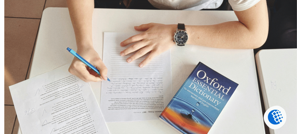
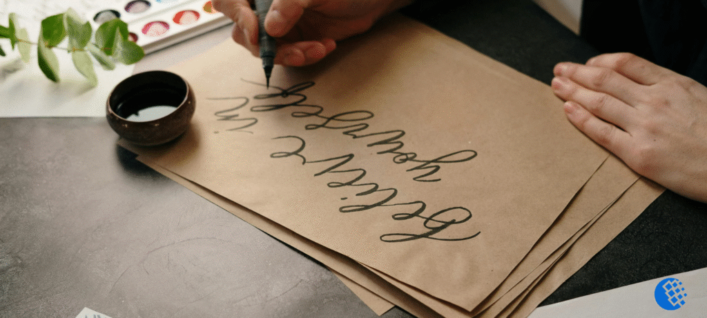
Neat handwriting? Not needed. A fancy pen set? Skip it. Art training? Nope, that’s not required either. A pencil and a little patience will get you through day one.
Honestly, the order is where most people slip. You buy a pen, find an alphabet on Pinterest, copy it for a few days, and by week two it all looks wrong, so you stop. Been there? That’s exactly why this guide on how to learn calligraphy is built around sequence. First stroke at the start, first finished word at the end, and nothing random in between.
How to Learn Calligraphy Without Overthinking It
Calligraphy is writing letters with slow, planned strokes. You’re not trying to be quick. You’re watching how thick each line is, how tall the letters sit, and how much room is left between them.
Everyday handwriting is made for speed. Calligraphy is made for shape. That’s the whole difference, really.
It also isn’t the same thing as hand lettering, though people swap the two terms constantly. In calligraphy you write each letter in a set of strokes. In lettering you draw the letters, and you often add decoration. If you’re curious about how the craft started and how the scripts changed over centuries, Britannica’s page on calligraphy gives a good short history.
So what does that mean for you? It means you’re not copying pictures of letters. You’re learning how a pen moves. Once you get that, the letters mostly take care of themselves.
Step 1: Pick One Calligraphy Style
Don’t buy anything yet. Seriously. Figure out which style you want first, because a brush pen, a metal nib and a flat broad-edge nib are three totally different shopping lists, and guessing wrong gets expensive fast.
Brush pen calligraphy is where most people end up starting, and there’s a good reason. That bendy tip does half the work for you. Press down and the line fattens, ease off and it thins out. Cards, journal headings, a quote for the fridge? It handles all of it just fine.
Pointed pen calligraphy uses a metal nib in a holder, dipped in ink. Copperplate is the best known example. The lines are lovely, but you’ll deal with ink, cleaning, and a bit of setup, so it suits you better after the basics.
Broad-edge calligraphy uses a flat, angled nib. Gothic and Blackletter come from here, and the history of these scripts is covered well on Wikipedia’s calligraphy. They look bold and dramatic. They also demand a steady nib angle, which takes time.
Pencil and faux calligraphy need almost nothing. For faux calligraphy you write a word in normal handwriting, then thicken the downstrokes by hand. It’s a cheap way to see how letters are built.
Not sure which one? Start with pencil or faux. Move to a small brush pen when the basic strokes feel familiar. And stay with one style for a few weeks. Jumping between styles confuses your hand, and it shows.
Step 2: Gather Simple Supplies
You need less than the shops want you to believe.
- A pencil, brush pen, or beginner nib, depending on your style
- Smooth paper
- A ruler and pencil for guidelines
- A soft eraser
- Printable practice sheets
Paper is the thing people skip. Rough printer paper chews up brush pen tips and makes lines look scratchy. Marker paper or any smooth pad is much kinder. If you’re using a dip pen, test a corner first and see if the ink bleeds.
For brush pens, go small. A small-tip pen like the Tombow Fudenosuke is easier to control than a big floppy brush, which is why it shows up on so many beginner lists.
One more thing. Don’t blame the pen for every wobbly line. Pen, paper, and your pressure all play a part. If your lines shake, slow down before you spend more.
Step 3: Learn the Pressure Rule
Almost all modern calligraphy rests on one idea. Press lightly going up. Press harder going down.
Upstrokes come out thin. Downstrokes come out thick. That contrast is what makes writing look like calligraphy.
Broad-edge scripts are the exception. They get their thick and thin from nib angle and direction, not pressure. For brush pens and pointed pens, though, pressure is everything.
Try a warm-up. Touch the tip to the paper and glide up with almost no force. Then pull down and press a little more so the line widens. Don’t mash the tip flat. Let it open up on its own.
Now fill a row with thin upward lines, and under it a row of thick downward ones. Then alternate. Look at what you made. Are the thin lines about equal? Do the thick ones match? Did your hand stay steady?
Your first rows will wobble. That’s fine. You’re just finding out how the tool answers your hand.
Step 4: Practice Basic Strokes Before Letters
This is where a lot of beginners go wrong. They head straight for the alphabet. A better way to learn calligraphy step by step is to practice the small shapes letters are made from.
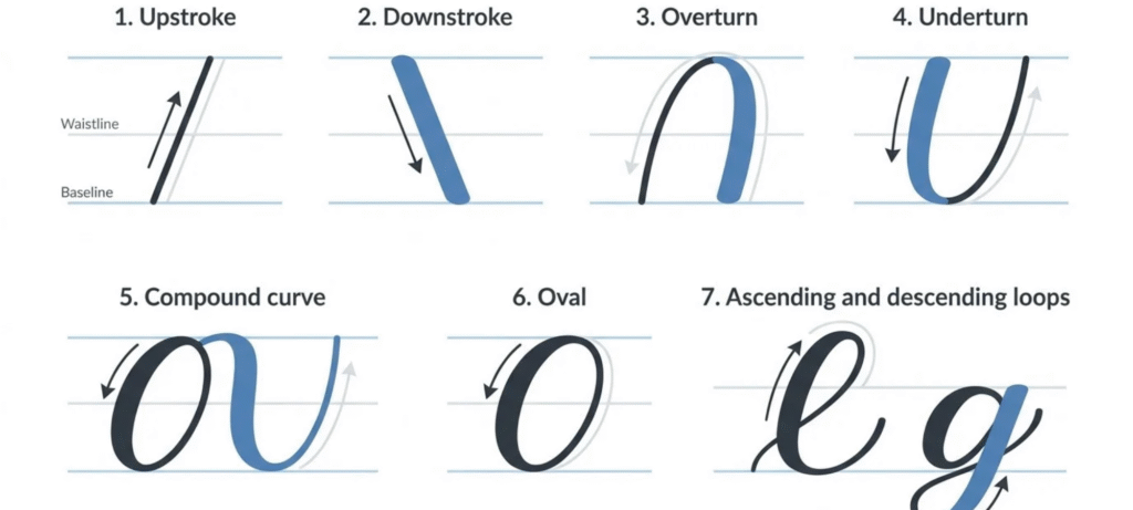
In modern brush calligraphy, the usual building blocks are:
- Upstroke: a thin line going up
- Downstroke: a thicker line going down
- Overturn: a curve shaped like an upside-down U
- Underturn: a U-shaped curve, thick going down, thin coming up
- Compound curve: an overturn and an underturn joined in one move
- Oval: the round shape behind letters like a, d, and g
- Ascending loop: a loop that rises above the letter body, as in h and l
- Descending loop: a loop that drops below the baseline, as in g, j, and y
These are practice shapes for modern calligraphy. Traditional scripts have their own drills, so follow the ones that match your style.
Beginners usually do better with a worksheet that has a baseline, a waistline, and slant guides. They keep your height and angle steady. Once your letters look fairly consistent, try writing without them and see how you do.
Skip the urge to fill a whole page. Make a few strokes, look closely, spot the weakest one, and repeat that. Ten careful strokes teach more than a hundred rushed ones.
Step 5: Build the Calligraphy Alphabet Slowly
Once your strokes feel steady, lowercase letters are next. Don’t treat every letter like its own puzzle, though. Group them by shape and the whole thing gets lighter. The letters i, l, t and u run on simple vertical strokes. Then a, c, d and g, which are all built around an oval. The letters h, b and k lean on loops, while g, j and y dip below the baseline. Use these groups to plan your practice, but don’t take them as law. Each script builds its letters a little differently.
So choose one exemplar, just one alphabet sheet you trust, and stick with it. Take the letter a. In plenty of modern styles you start with a light entry stroke, then an oval, then a closing stroke. Another script? It might do all of that another way. And if you mix letters from five different alphabets, your writing will look uneven. Every time.
While you practice, keep an eye on four things:
- Height: do the letters stay between your guidelines?
- Slant: is the angle the same every time?
- Spacing: are the gaps even?
- Connections: do the joins look smooth?
Leave capitals and flourishes for later. Swirls are fun, but they can’t cover up uneven letters.
Step 6: Write Your First Words
Once single letters feel okay, join them into short words. Pick words with repeating shapes. “Minimum” is great for repeated downstrokes. “Hello” and “lilac” give you loops and curves. Your own name makes a nice first goal.
Here’s a worked example using the word “hello”.
First, write it in plain handwriting. Notice where the loops sit and how wide each letter is. Second, break it into strokes. The h is an ascending loop plus a compound curve. The e is a small oval-style shape with a light exit. The two l’s are ascending loops with a downstroke. The o is an oval. Third, write it again slowly using those strokes. Fourth, check the gaps. Is the space between the two l’s the same as between the e and the first l? Fix the one that looks off and write it a third time.
That little loop of write, break down, rewrite, check is one of the best practical examples of how drills turn into real lettering.
Lift the pen between strokes whenever your style needs it. A word doesn’t have to be one flowing line. Control beats speed.
For faux calligraphy it’s simpler still. Write the word, mark every downstroke, draw a second line beside each one, and fill the gap.
Step 7: How to Learn Calligraphy at Home on a Budget
You can learn calligraphy at home with a table, decent light, and about 20 quiet minutes. No studio needed.
If all you own is a pencil, use it. That’s one way to learn calligraphy without the pen. Practice faux calligraphy and pressure drills, where you press lightly on the way up and a bit harder on the way down. A pencil won’t flex like a brush pen, but it teaches you letter shapes and spacing, and that’s most of the job.
Fountain pens are different. Check the nib first. Most fountain pens have a firm nib that can’t make true thick and thin lines, and pressing hard to force it can bend the tip. They’re still lovely for neat, even-weight lettering. Just don’t treat one like a brush pen.
Before you write a single stroke, give your hand some space. Slouching over the desk won’t help. Sit however feels easy, then turn the paper until your wrist stops fighting it. The pen should sit lightly in your fingers, lighter than feels natural at first. Hand aching? Cramp creeping in? Drop the pen for a minute and shake it out. Clenching is usually the real reason lines come out shaky.
And getting started matters more than people admit. I’d leave a small tray on the desk with the pen, paper and worksheet already sitting in it. When beginning takes zero effort, you actually begin. A fancy setup? It doesn’t come close.
Step 8: Build a Practice Routine That Sticks
You don’t need hours. Short, regular sessions beat one long session on Sunday, because calligraphy is a motor skill and your hand learns by repetition.
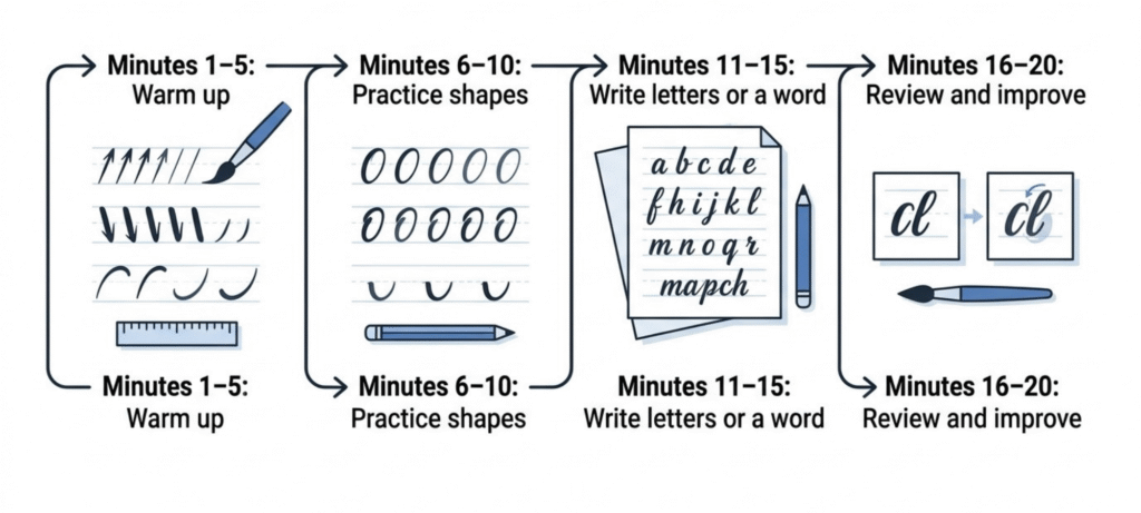
A simple 20-minute session looks like this:
- Minutes 1 to 5: warm up with light upstrokes, downstrokes, and curves
- Minutes 6 to 10: drill one or two shapes
- Minutes 11 to 15: write a few letters or a short word
- Minutes 16 to 20: look over the page and pick one thing to fix next time
If you want something more concrete, try this first-week plan. It’s a suggestion, not a promise of mastery.
- Day 1: pen control and light upstrokes
- Day 2: downstrokes and pressure contrast
- Day 3: overturns, underturns, and compound curves
- Day 4: ovals and your first lowercase letters
- Day 5: spacing and simple connections
- Day 6: one short word, written slowly
- Day 7: lay out your first and last pages and compare them
Date every sheet and keep them. After a few weeks, put them in order. You’ll see steadier lines and cleaner curves, which you’d miss if you only looked at today’s page.
And if one stroke keeps going wrong, pull it out and practice it alone. Repeating a mistake a hundred times just teaches your hand to make it.
Step 9: Use Free Online Lessons and Worksheets
You really don’t need to pay for a course on day one. There’s a lot of good free material out there. If you want to learn calligraphy free online, go for lessons where the camera stays close on the pen and the teacher talks through stroke direction, pressure and letter shapes. Anything that skips those isn’t much use.
The Happy Ever Crafter and The Postman’s Knock both have beginner videos and printable sheets. Still, pages move or disappear. Open the one you plan to use and make sure it’s alive and fits your style before you build a routine around it. YouTube helps here, since you can pause right at the moment the stroke happens. Pause, rewind, try it. Repeat.
Printable PDFs work well when you’re offline. The good ones show stroke order, come with clear guidelines, and leave plenty of blank rows to repeat in. A sheet full of pretty finished letters and nothing else? That’s inspiration. It won’t teach you anything.
Apps can work too, especially on a tablet, if drawing on a screen is something you enjoy. A screen just doesn’t feel like a real pen dragging ink across paper, so don’t expect it to stand in for paper. Pick one because you like using it.
Staying organized makes online learning a lot easier, and these tips for online learning that actually work can help you hold a routine together. Books deserve a look as well, particularly ones packed with alphabets and stroke diagrams. Just check the style matches your tools first.
Step 10: Common Beginner Mistakes and Easy Fixes
Slow progress usually comes from a few habits, not from lack of talent.
Pressing hard on every stroke. It kills the thick and thin contrast. Practice light upstrokes on their own first.
Jumping into the full alphabet. Shaky strokes make shaky letters. Go back to the drill that’s causing trouble.
Using the wrong paper. Rough paper wears down tips and thin paper bleeds. Test a small spot.
Switching styles constantly. Each script has its own rules. Stay with one for a while.
Writing too fast. Slow down until the shape is right. Speed shows up later without you chasing it.
Skipping spacing. Nice letters can still make an ugly word. Check the gaps, not just the shapes.
Comparing yourself to professionals. You’re seeing years of practice. Compare this week’s page to last month’s.
How Long Does It Take to Learn Calligraphy?
It depends on the style, how often you practice, and what you want to do with it.
Faux calligraphy can give you decent-looking words in a few sessions. Brush pen lettering takes longer because you’re managing pressure, spacing, and rhythm all at once. Formal scripts like Copperplate or Gothic take the longest, since the angles and proportions are strict. Like any hands-on skill, it follows the same pattern as picking up an instrument, which our post on how hard it is to learn guitar touches on.
So skip the deadline. Set a small first goal instead: learn the basic strokes, write a handful of lowercase letters cleanly, and finish one short word you’re happy with. Then keep going.
Frequently Asked Questions
Can I teach myself calligraphy?
Yes. Good tutorials, worksheets, and regular practice are enough. A teacher helps you catch mistakes sooner, but you don’t need one to start.
How hard is it to learn calligraphy?
The basics are friendly. Getting neat, consistent results takes practice because you’re controlling pressure, spacing, and shapes together. Starting with pencil or faux calligraphy makes the first steps easier.
Can I learn calligraphy without a special pen?
Yes. Faux calligraphy works with any pen or pencil. Write the word, outline the downstrokes, and fill them in. A pencil also lets you practice pressure, though it won’t behave like a flexible brush pen.
How do I learn calligraphy with a fountain pen?
Look at the nib type first. A standard firm nib suits even, controlled lettering but can’t make real thick and thin strokes. Don’t press hard to fake a brush look, because that can damage it.
Can I learn calligraphy for free online?
Yes. Free videos, tutorials, and printable sheets can teach strokes and letter construction. Choose one style and stick with it before buying extra courses.
How do I use a step-by-step PDF to learn calligraphy?
Pick a sheet with guidelines, stroke direction, and room to repeat each shape. Work through it in order: strokes, then lowercase letters, then words.
How can I learn calligraphy well?
Practice a little most days, fix one weakness at a time, and compare your work across weeks. Even spacing and steady heights matter more than flourishes early on.
Final Thoughts
Learning calligraphy feels much less scary once you cut it into small steps. Pick one style. Buy only what you need. Practice strokes before letters, and letters before words. Keep sessions short and date your pages.
If you’re still wondering how to learn calligraphy in a way that sticks, here’s the honest answer. Show up for 15 or 20 minutes, slow down, and care more about one clean stroke than a page of rushed ones. The improvement is quiet, and then one day you’ll look at a word you wrote and want to frame it.
So grab a pencil and a ruler, and draw your first row of thin and thick lines today.