

Pages optimized for international student recruitment do a pretty simple thing. They answer the applicant’s questions before the applicant has to ask. Imagine you’re a student in Lagos, Hanoi, or Karachi. You can’t pop into the admissions office. You’ve got a phone, maybe a laptop, and a website. That’s it. So the website has to do everything.
I’ve looked at a lot of university sites over the years, and here’s what bugs me. Most of them are built for locals. They assume you already know how the system works, what a “foundation year” is, or why a deposit matters. International applicants don’t know any of that. They’re asking whether their certificate counts, what it’ll really cost, whether a visa is likely, and what a degree gets them afterward. When the page stays quiet on those, they don’t write in. They leave.
So let’s go through what these pages need, how Google and AI tools read them, and how you can tell if they’re bringing in applicants or just visitors.
What Makes Pages Optimized for International Student Recruitment Actually Work?
A lot of teams treat this as a traffic problem. More visitors, more applications, right? Not really. I’ve seen pages with solid rankings that still bring in almost no inquiries, because the visitor shows up, gets confused, and bounces.
Think of it as three jobs. The right student has to find the page. Then the page has to earn their trust fast. Then the next step has to feel obvious, almost boring. If one of those fails, the whole thing falls apart.
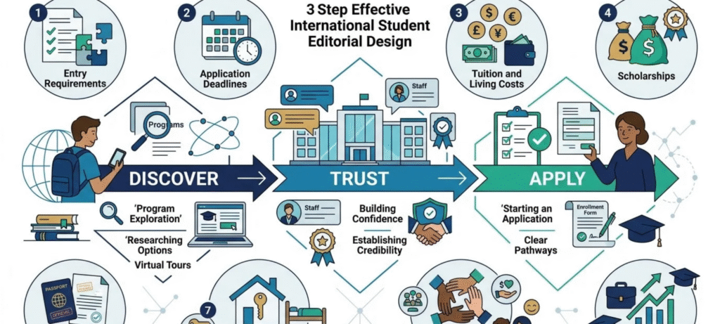
And the sad part? The answers already exist. Admissions has half of them. Finance has some. The housing office has another piece, and the visa team has the rest, each on a different page in a different voice. Your real job is pulling it all together in one place, where a nervous applicant will actually look.
Start With the Questions International Applicants Actually Have
It’s late evening and a student has three browser tabs open, going back and forth between Canada, the UK and Australia. Nobody does that for fun, they just want to know whether studying abroad is realistic for them. The doubts are usually the same ones: will my school certificate be accepted, how do I apply and by when, what will it all cost in my own currency, is a visa likely, where am I going to stay, and what’s waiting for me once I graduate? Those doubts end up as Google searches such as “study in Canada for international students” or “master’s in data science tuition and living costs”, and every one of them deserves a page of its own. A single generic “International Students” page can’t answer all of that, which explains why so many of them barely rank for anything. A good first step is a quick audit. Sit with your admissions staff, note down what applicants ask them week after week, and then check your site to see if each question gets a clear answer. Any question that’s still unanswered is simply your to-do list.
Make the Admissions Process Easy to Follow
People want to see the road before they start walking. So lay it out in plain words. Give the deadline for eNobody sets off on a trip without seeing the route first, and applicants are no different. So spell the process out in plain words. Put the deadline for every intake on the page. Name the qualifications you accept. List the English test scores you expect. And if an acceptance letter or a deposit is part of the process, tell students when it comes up and what it’s for.
Order matters here, so a numbered list makes sense:
- Look up the entry requirements for your program and your country.
- Collect your documents: transcripts, a passport copy and your test scores.
- Send in the application before the deadline.
- Wait for the decision, then accept your offer.
- Pay the deposit and complete the visa and enrollment steps.
Visas need a short note of their own. The rules change often, and your university doesn’t write them. Explain the general process, say which documents you issue, and point students to the official government immigration site for the newest rules. A “last reviewed” date on the page helps too. It’s a small thing, but it shows readers that a real person still looks after the content. If you want to give applicants something to keep, our guide on important documents to gather when studying abroad fits well right here.
Explain Tuition, Scholarships and Living Costs Clearly
If you only have time to fix one section this month, pick this one. Money is where good applicants get stuck. For a lot of families, this is years of savings, and “affordable education” tells them nothing. It’s a nice phrase. It isn’t a number.
I’d begin with the money, because that’s usually the point where an applicant gives up and closes the tab. Show the tuition for every program, per year, in plain text and not tucked away in a PDF. Then list everything else a student will end up paying for: housing, food, local transport, health insurance, books, visa fees, and the deposit with the date it’s due. Do the adding up yourself so the family doesn’t have to, and call the total an estimate, because that’s what it is. “Affordable education” means very little to a parent who has been saving for years and wants to see the real amount.
After that, show where the bill can shrink. Scholarships, bursaries, payment plans and work rights should sit next to the costs, so nobody has to dig through three more pages to find them. Spell out who qualifies as well. If an award only applies to certain countries or programs, put that in the first line. I’ve seen applicants get excited about a scholarship and then run into a condition buried at the bottom, and that damages trust far more than a high fee does. Pages optimized for international student recruitment can turn honest cost details into a selling point, and they should.
Build Trust Before Asking Students to Apply
Look at it from the student’s side for a second. You’re asking them to move to a new country, spend a big pile of money, and trust a school they’ve never seen. Clicking “Apply now” on the first visit? That’s a lot.
What builds trust is proof. Real students telling their real stories, with their country, program, and year. Alumni saying where they work now. Accurate notes on accreditation. Actual campus photos and short videos, not the same stock image of smiling strangers everyone uses. A virtual tour for people who can’t visit. Staff with names and a way to reach them.
Here’s a small habit that helps. Keep three kinds of statements separate on the page: your university’s own policy, government visa rules, and general advice. Readers get lost when they all blur together. Search engines tend to like pages that make their sources clear, too. And it matters even more on this topic, because it’s about money, visas, and big life choices.
Write for Students Who May Not Be Native English Speakers
Think about who is actually reading. For plenty of your visitors, English is the second language, sometimes the third. Write so they can follow without effort, but don’t dumb it down. These are capable people, and they can tell when a page is being patronizing.
A few habits go a long way. Keep sentences short. Make every heading say what’s underneath it. Drop the idioms, because “hit the ground running” or “tick the box” can leave a reader stuck on one line, wondering what it means. And whenever you bring in an admissions term, explain it once, right there. A conditional offer, say, is simply an offer that depends on one more thing, like an English test score. That’s all it takes.
If a section starts to feel heavy, cut it up with a small table or a short list, and keep paragraphs short on a phone screen too. There’s a side benefit as well. Lots of applicants will paste your page into a translation tool anyway, and plain English survives that far better than anything clever.
Design for Mobile-First International Applicants
For many students, the phone is the first screen that ever meets your university. Often on a slow connection. If the page crawls, or the form is miserable to fill in with your thumbs, they’re gone before reading a word.
So keep the text readable without zooming. Make buttons easy to tap. Compress images, lazy-load video, and drop the giant hero banners. Skip pop-ups that cover the content. If your team can handle it, a WhatsApp or live chat option works well in places where people prefer messaging to email. And make sure downloadable guides open cleanly on a small screen.
Forms matter a lot here. Ask for first name, email, country, program, study level, and intended intake. Leave passport numbers and full addresses for later. Those country and program fields also help you sort leads, and our piece on lead scoring criteria in higher education shows how to focus on the inquiries most likely to convert. For speed, Google’s web.dev guide to Core Web Vitals explains what the loading, interactivity, and stability scores actually mean.
Localize Pages for Different Recruitment Markets
Translating one page into ten languages isn’t localization. It’s just translation. Real localization means the content itself changes, because the applicant’s situation changes. Which qualifications do you accept from their country? What’s the usual English test route? What’s the cost in local currency? Which scholarships apply? And what do students from that country say about the place?
Take India. A dedicated page might cover accepted school-leaving qualifications, the programs Indian applicants ask about most, a cost summary, visa notes, and quotes from current students from India. A page for Nigeria, Pakistan, China, or the Middle East would look different in substance, not just in the name at the top.
Only build these pages when you’ve got something genuinely different to say. If you just swap the country name into identical text, you add nothing, and search engines can treat those pages as low-quality duplicates. My advice? Pick your two or three biggest markets. Do them properly. Then expand.
Optimize International Student Recruitment Pages for Search
Once the content is solid, help search engines find and understand it. Start with keyword research for each market, because students in different countries search differently. Look at country plus course, and the practical stuff around tuition, visas, scholarships, and deadlines. Each of those deserves its own page, with a clear title and meta description naming the program, the audience, and the benefit.
Use one H1 per page, then a clean H2 and H3 structure under it. Link country pages to program pages, and program pages to requirements, costs, and visa pages, so visitors and crawlers can follow the trail. Keep key details in real text, not stuck inside images or behind a login.
If you run language or regional versions, use hreflang so the right version reaches the right person. Google walks through it in its guide to localized versions of your pages. Structured data like Organization, Course, BreadcrumbList, and FAQ markup can help search engines understand a page, but it won’t guarantee special results. Nothing here guarantees a ranking. These steps just clear the obstacles out of the way.
Show What Student Life Actually Looks Like
A degree isn’t the only thing an applicant is shopping for. They’re also trying to work out what their days would look like in a country they’ve never lived in, and if your page doesn’t help with that, they’ll fill in the blanks with guesses. So put the residence halls on the page, photos included, and write down what a room costs. Say how people get to lectures, where they end up eating on a night nobody feels like cooking, and what the area is like on a boring Tuesday around seven, not during the busy week when everyone’s being welcomed. Mention your clubs and cultural societies, and if you have religious or dietary support, say that too. Then be honest about safety, and name the people an international student can go to, from the first orientation session to the counseling office when things get hard in second semester.
Videos from students who actually study there usually work better than anything the marketing team writes, because you can hear it’s a real person talking. Parents matter here as well, and honestly they often read this part more closely than their kid does. Give them one clearly labeled spot covering safety, housing, health insurance and who to call in an emergency. For plenty of families, that single section decides whether they feel okay about the whole thing.
Don’t Stop at Admission: Show the Outcome
There’s a big question sitting behind every application. What do I get for all this? International students are making a serious financial and personal bet, so “what happens after I graduate?” is a real conversion question.
Show graduate employment information with a source and a year. Mention internships and career services, and explain what post-study work options exist, while pointing readers to official sources for current immigration rules. Introduce the alumni network and the employers who recruit from your programs. If further study is a common route in your subject, say that too.
Don’t make up numbers here. A smaller, honest statistic with a source beats a flashy claim nobody can check. Readers can tell the difference.
Technical SEO and UX Checklist
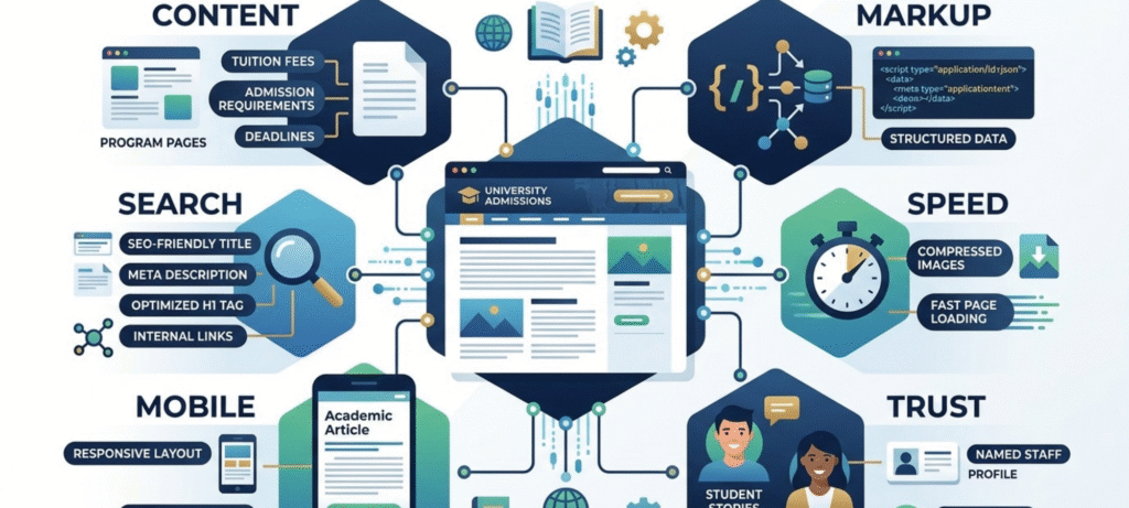
Here’s a quick view of what to check before you publish pages optimized for international student recruitment:
| Area | What to check |
|---|---|
| Content | Costs, requirements, deadlines, and visa guidance on the page, dated |
| Search | Unique title, meta description, one H1, internal links, hreflang if needed |
| Markup | Organization, Course, BreadcrumbList, FAQ where it truly fits |
| Speed | Compressed images, lazy-loaded video, passing Core Web Vitals |
| Mobile | Readable text, tappable buttons, short forms, no intrusive pop-ups |
| Trust | Named staff, real student stories, accurate accreditation, last reviewed date |
| Language | Short sentences, no idioms, key terms explained |
How to Measure Whether Recruitment Pages Are Working
Traffic on its own doesn’t tell you much. What you really want to know is whether visitors turn into inquiries, application starts, finished applications, offers, and eventually enrolled students.
Begin with organic impressions and clicks. Then look at engagement, like scroll depth, video views, and guide downloads. After that, track inquiry rate and application-start rate, and compare them with completion rate. If lots of people start but few finish, the application itself is probably too hard.
Then split everything by country, device, and program. You may find one market sends plenty of visitors but few applications, which points to a content gap for those people. Another may convert fine on desktop and badly on mobile. Change one thing at a time, like a shorter form or a clearer cost table, and compare the results before you roll it out.
FAQs
What makes a good international student recruitment page?
It answers the questions applicants really have: eligibility, deadlines, costs, visas, housing, and outcomes. It’s written in plain English, loads fast on mobile, shows real proof, and gives a clear next step.
How can universities attract international students online?
Build separate pages for countries, programs, costs, and requirements. Match what students actually search for, share real student stories, and make it easy to contact an advisor.
What information should international students find on a university website?
Entry requirements, English test scores, deadlines, tuition and living costs, scholarships, visa guidance, accommodation, student support, and career outcomes.
How can universities optimize international admissions pages for SEO?
Research how students search in each market, write clear titles and meta descriptions, link related pages together, use hreflang for regional versions, and add structured data that matches the content.
Should universities create country-specific international student pages?
Yes, when they have real, different information to share, like accepted qualifications, local costs, and student quotes. Pages that only swap the country name aren’t worth building.
Do pages optimized for international student recruitment need schema markup?
It helps search engines read a page, but it isn’t a ranking guarantee. Only use markup that honestly matches what’s on the page.
What SEO strategies work for international student recruitment?
Country plus program targeting, localized content, clear internal links, fast mobile pages, and honest, current information on costs, deadlines, and visas.
How can a university improve international student enrollment?
Shorten the first form, match each call to action to where the visitor is, speed up mobile pages, and track the full path from visit to enrollment by country and program.
Final Thoughts
Here’s what I’d tell any admissions team. Don’t chase clever. Chase clear. A student sitting far from your campus just wants straight answers, and a bit of proof that you mean them. Begin with costs, requirements, deadlines, and the visa pages, since those sit closest to the decision. Add country pages later, only where you’ve got something real to say. Pages optimized for international student recruitment work best when someone keeps them up to date, because one wrong date can undo a lot of good writing. For a wider picture of student movement around the world, see the Institute of International Education’s Open Doors data.